“Rui DeSousa and his partner Anna Rigatoni have decided to open a new Italian restaurant. They have decided on the name “Bella Bella Mozzarella”, hoping the catchy name along with some colourful advertising will launch their business to the forefront of the restaurants of choice in their neighbourhood. Rui and Anna have decided their emphasis will be to create a traditional menu of Italian cuisine, presented in a rustic Italian home atmosphere and served by friendly staff. As a graphic artist you have been commissioned to create a logo, business card, business card holder, and poster for the owners of this restaurant. Your design must reflect their business model and philosophy. The target market is family of all ages.”
Specifications for the logo:
-Vector based
-Printed one side
-Colours: 100% black and white +1 spot colour
-Bleed 0.125” (if needed for design)
-Screening: 300 dpi
-Printed one side
-Colours: 100% black and white +1 spot colour
-Bleed 0.125” (if needed for design)
-Screening: 300 dpi
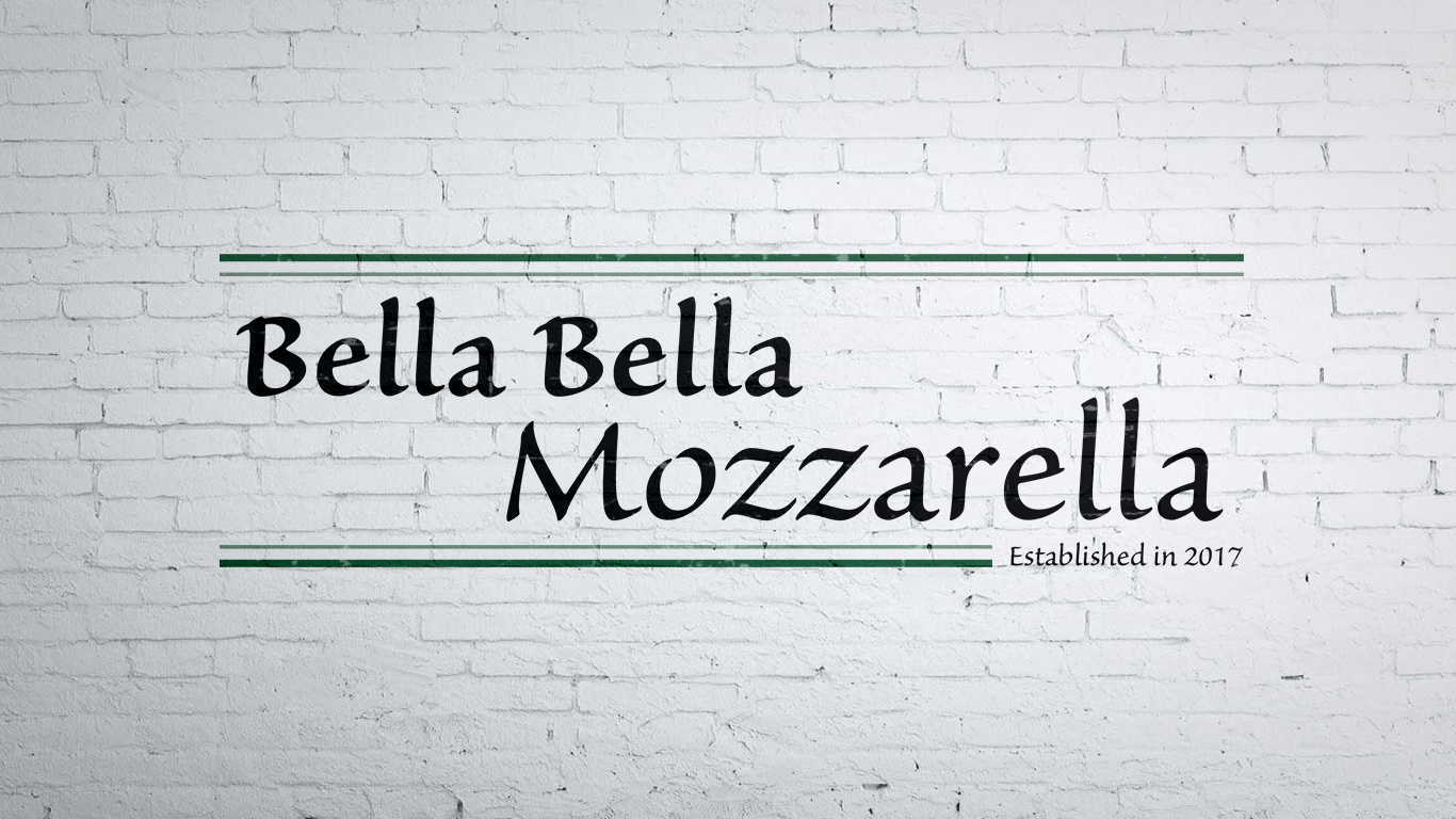
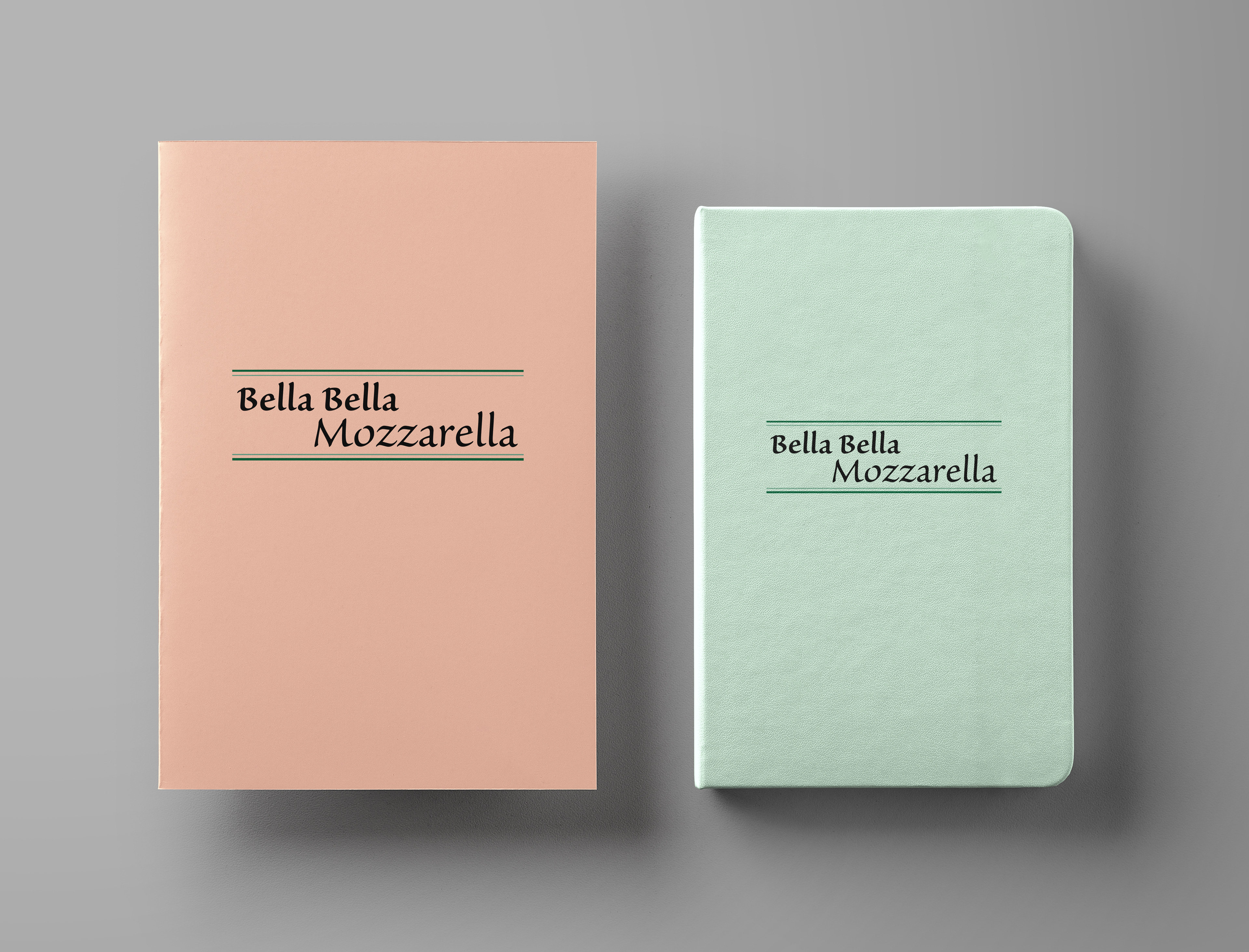
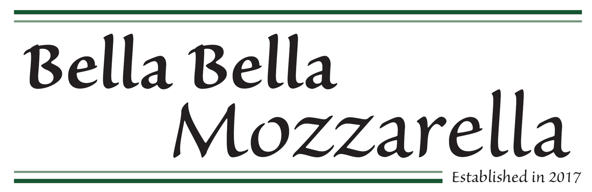
I decided to go with two different versions for the logo. The first one is designed for use on signage, and the second is for stationery. I made the decision to go with two versions because I found that the "Established in 2017" was too small when I tried to place it on a business card. I chose the font Sanvito Pro because it is easy to read, even for kids. The style also reminded me of other Italian and pizzeria locations, so I felt it was fitting. The pantone green lines on the top and bottom tied everything together nicely, ensuring that the logo would be easily identifiable as it's own element when used with other items on an object.

Specifications for the business card:
-All colours must be CMYK format
-Names, phone numbers, addresses, and restaurant name must be included
-Card must be printed on both sides
-Bleed 0.125”
-ICC Colour profile for images: Coated GRACol 2006 (ISO 12647-2:2004)
-Final trimmed size 3.5” x 2”
-Names, phone numbers, addresses, and restaurant name must be included
-Card must be printed on both sides
-Bleed 0.125”
-ICC Colour profile for images: Coated GRACol 2006 (ISO 12647-2:2004)
-Final trimmed size 3.5” x 2”
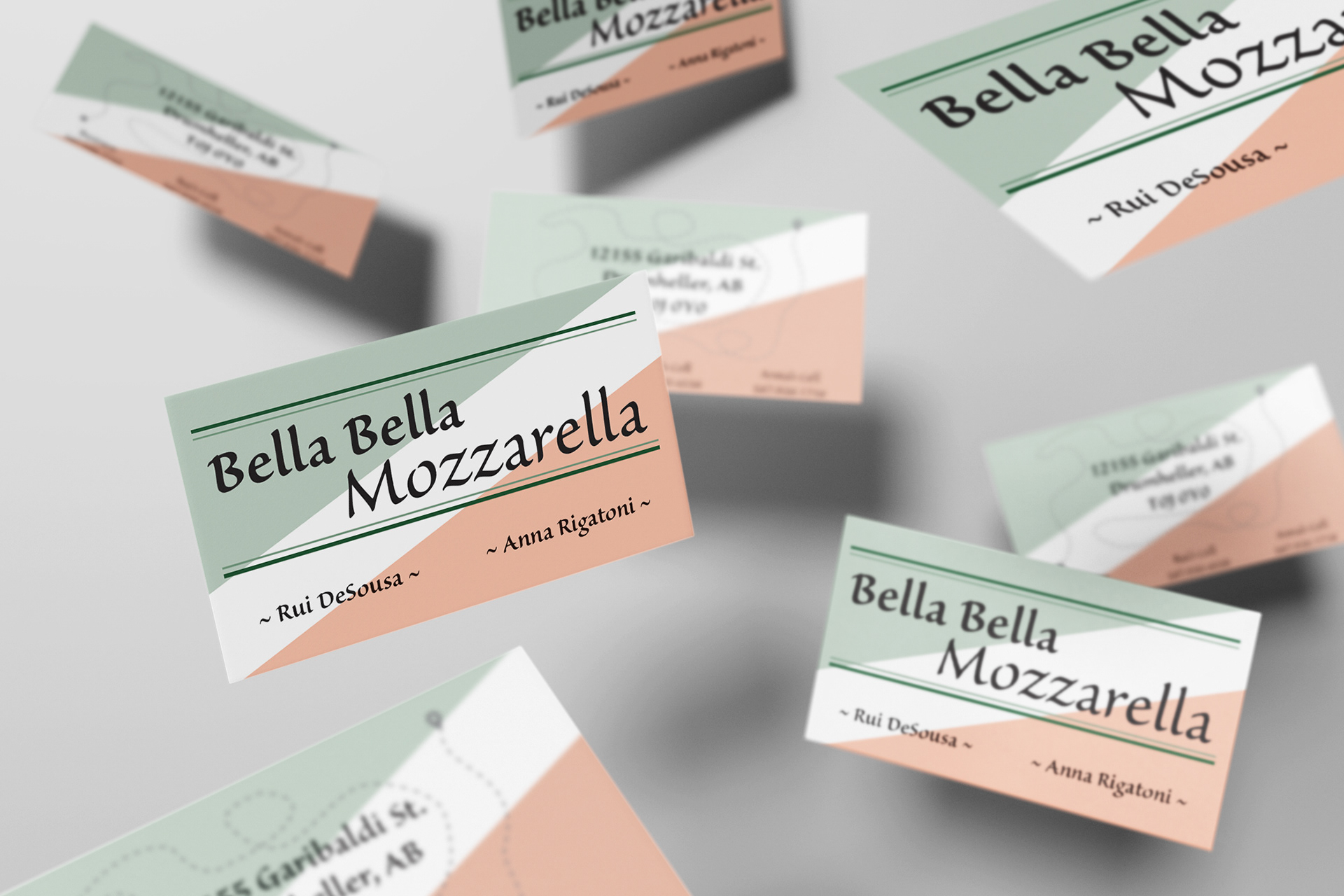
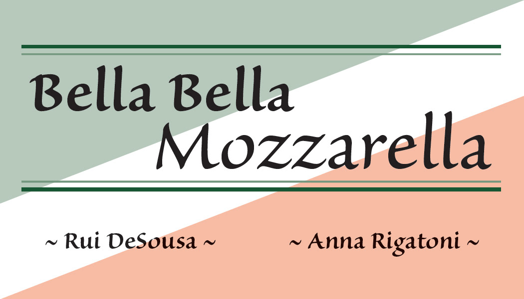
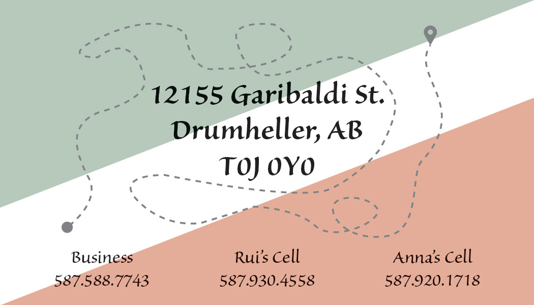
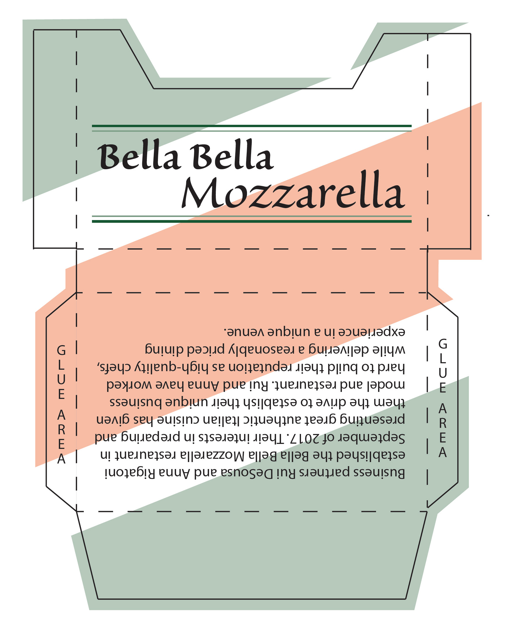
For the business card, I decided to go with a simple layout. I chose to use an Italian flag-like background to tie it in with the Italian theme of the restaurant. I carried the Pantone green over from the logo, and used a lighter tint of it for the background. The front has a clean layout, with just the restaurant logo, and the names of the owners. The back contains the rest of the required information, as well as a simple map graphic that I created to make the card more unique.
Also included below is the business card holder I designed to hold the cards. It was required to include the company name and information. I carried over the Italian flag design for the background, and placed the logo on the front where it can be easily seen. The back of the holder has the restaurant information.
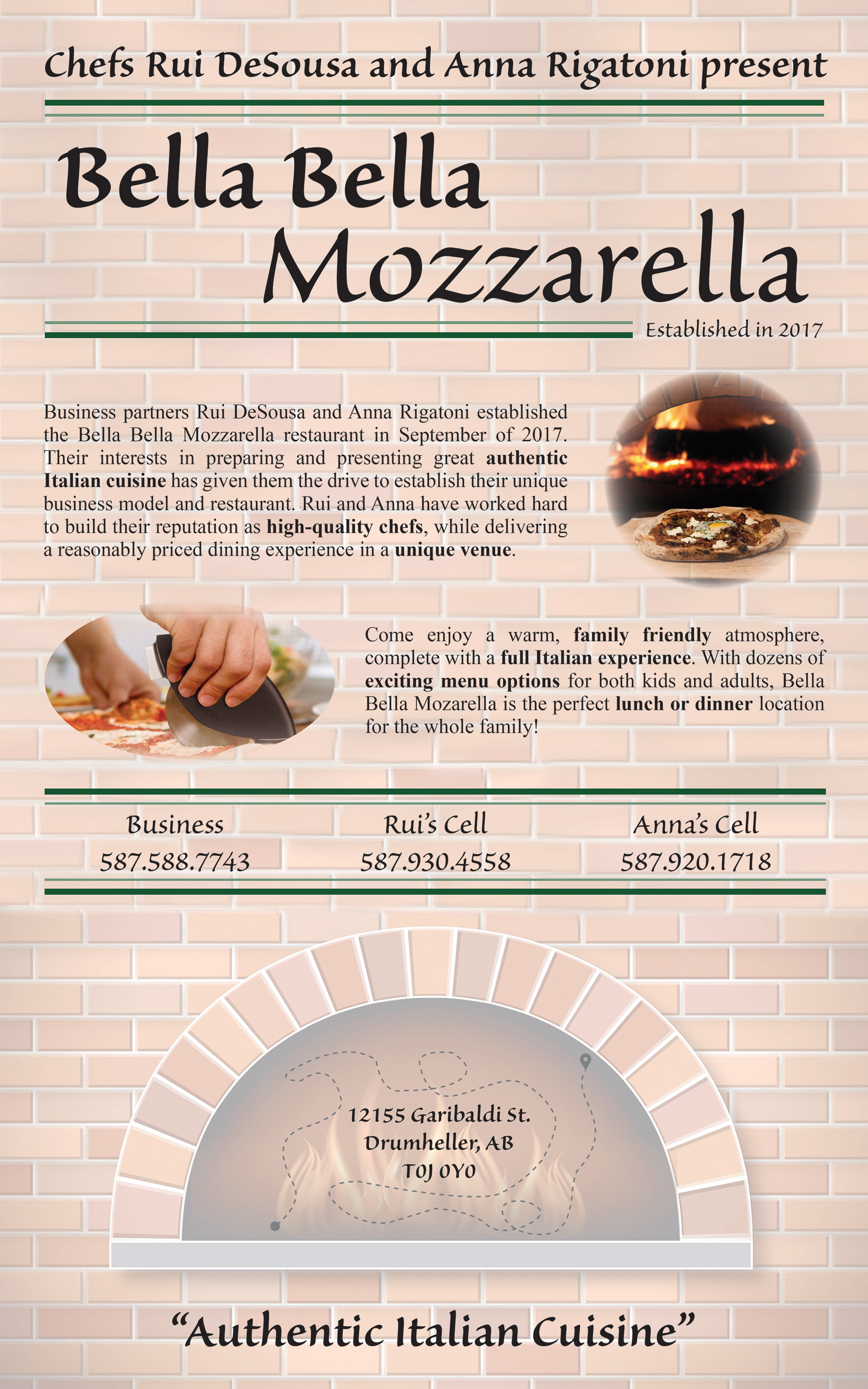
Specifications for the poster:
-All colours must be CMYK format
-Names, phone numbers, addresses, and restaurant name must be included
-3 images must be included from the supplied files
-Bleed 0.125”
-ICC Colour profile for images: Coated GRACol 2006 (ISO 12647-2:2004)
-Final trimmed size 10" x 16"
-Names, phone numbers, addresses, and restaurant name must be included
-3 images must be included from the supplied files
-Bleed 0.125”
-ICC Colour profile for images: Coated GRACol 2006 (ISO 12647-2:2004)
-Final trimmed size 10" x 16"
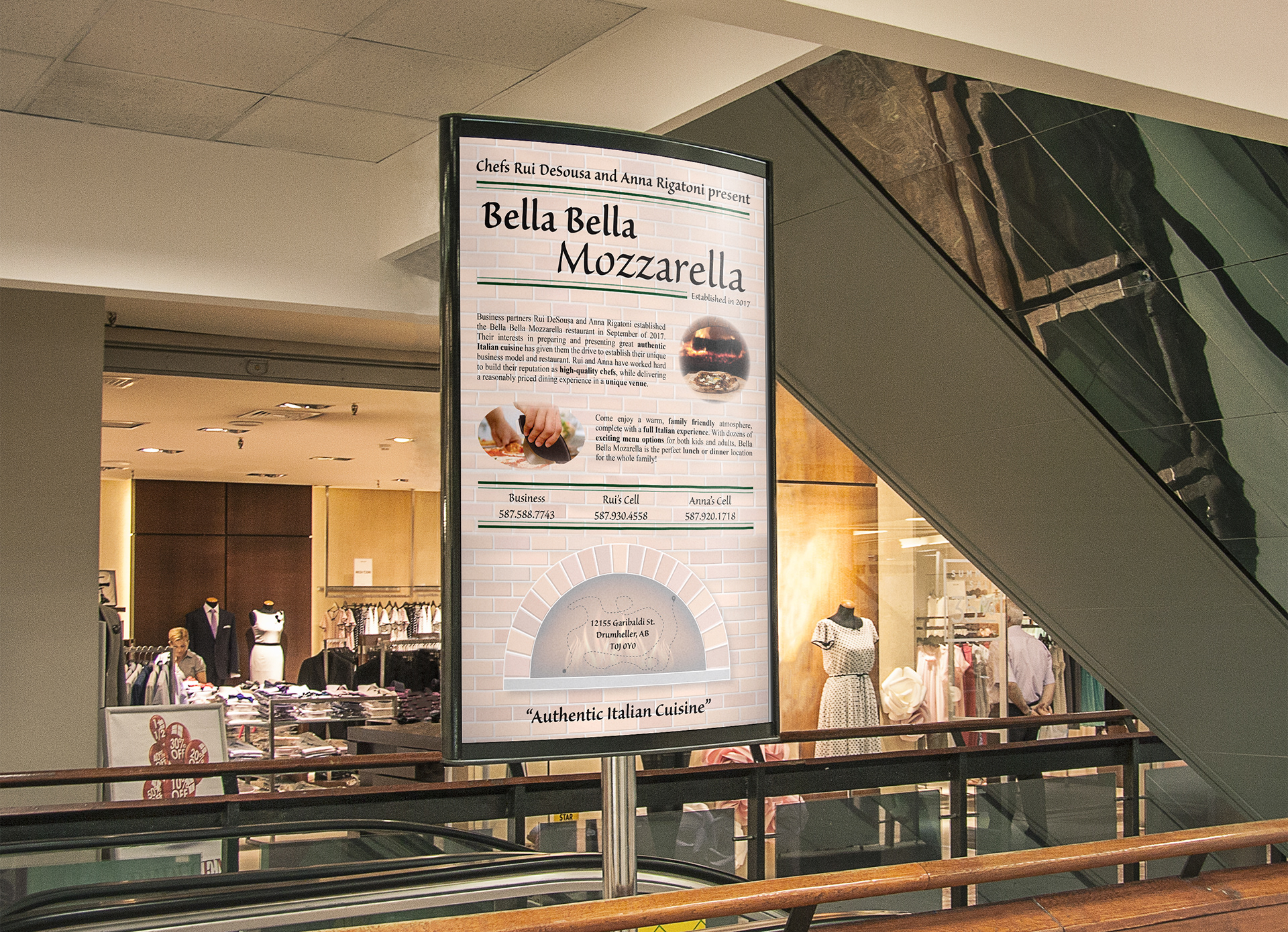
For the poster, I carried over the same theme from the other items I created. I included the tagline at the top to include the Chefs' names in a visually noticeable way, and tied it into the restaurant logo this way. I included the company information, and wrote my own small block of text to emphasize on the family friendly atmosphere of the restaurant. For the phone numbers, I copied the Pantone green line style that I used in the logo, both to tie them into the theme of the poster, and to make them stand out more. The background of the poster was taken from the provided files, however I had to extend it to cover the entirety of the poster. I did this using Photoshop. The address is presented in the same style as the business card. The tagline at the bottom of the poster is an excerpt from the provided text. I used it to emphasize the intent of the restaurant, and also to peak peoples interest if they just skimmed the poster.